Cover Page

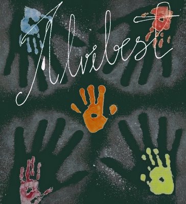
The cover design was a well conceived idea and was painstakingly put together by two artists. Alvibest takes this opportunity to laud their efforts. We shall discuss the making of the cover design here followed by the idea behind it.
Part 1: An adult hand was placed against a graphite sheet, and white paint was used to brush-paint around it. Hence, the adult hand's outline is not well-formed but is basically white rendered as a powder effect.
Part 2: Children were provided with a lot of colours and were allowed to run amuck on chart paper. They kept stamping their hands in every colour and going pitchaack on the chart paper. Their teacher who is also a brilliant artist (she sketches, paints, etches, is into pottery, poetry and... well, you name it!) collected these and sent them over to the studio.
Part 3: The adult hand and the child hands were digitally superimposed such that a child's hand fits well into the adult hand. Four such pairs were created and the cutest little hand was placed outside all of them in the centre.
Idea behind it: The idea was laid out by the Editor who had already planned on a theme-based issue. This issue is dedicated to children, growth and innocence. What he wanted was basically what the artists have achieved. What he put in words before the image was formed, is as follows:
"What I would like to see is innocence lead by responsible maturity but not containing it or restricting it. An adult should help and guide a child in this world but essentially never bind them down to personal beliefs and philosophies. A child's hand should be in full colour, but the adult hand should be hollow. The outline of the adult shouldn't be solid, thereby allowing the child to grow out of the adult guidance into a wonderful world where responsible adults exist and are ready to help them whenever they need it. The adult hand should be in white which reflects all colours. Hence, a child is allowed to be their personal shade of yellow, red, pink or what you please. The child should be represented in bright colours and the hand should be full. That would represent the potential that each child holds. The wrist of the adult hand should be absent providing an outlet for the child as well as a personal escape for the adult. The image should represent the symbiotic relationship between a child and a mature responsible adult."
The artist felt the need to place one hand outside all adult hands and made the 4 hands direct towards that little palm in order to signify the truth that can only be found in the immense innocence and simplicity that a child represents...
Personal reflections and discussion about this cover page are welcome on this post...


4 Comments:
Dear Parvati,
Thanks for your feedback. What the Editor meant was that the adult hand needs to be hollow and done (the powder effect) in white. Not filled in white but made hollow using white. This is the problem when visual art is represented in words! :-D
I hope we didn't miss your feedback after the "Final verdict - YES YES AND YES!
The"
Dear Parvati,
I am not sure what you mean when you ask "could you tell how I could end up reading all that is in Alvibest? What is the process?" Are you asking me about back issue and reading the current one? You would need to subscribe to the magazine and we should occasionally make provisions for letting subscribers download back issues. A subscriber is free to send a mail to subscribe.alvibest@gmail.com and request a particular issue (or issues). If you are talking about the content on the blog, I suppose you merely have to click on the links! :-)
The theme is simply wonderful. The portray of innocence is beautiful.Children are influenced by their parents and unless allowed to choose to decide they lose their individuality. To be innocent in this world is the toughest part and I really love this whole idea and the expression of it.
Dear Anon,
Thank you. Yes indeed, it is very difficult to be innocent! :-)
Post a Comment
<< Home